
with articles on computer applications in photography
|
Is It All in Postprocessing? A landscape case study |
|
|
Back to the Photo Bytes section, with articles on computer applications in photography |
|
This was one of those frustrating shots, when a scene looks lovely in real life, but so disappointing in a picture. Long shadows everywhere except the tips of some rocks — two minutes or so till sunset, take it or leave it.
Shot with the Olympus E-M1 and the MZD 12-40/2.8 lens at 40 mm; aperture priority (compensation of -1 EV to preserve the small-sized highlights): 1/125 s at F/6.3, ISO 200. The image was converted to RGB in-camera (no raw file): full-size SHQ (1:2.7) JPEG, Natural mode, contrast and sharpness tuned down. The original frame as recorded by the camera is rather disappointing. Still, I believed in its potential and decided to check if and how it can be improved in postprocessing, and how the results would be affected by monochrome conversion. While the photo editor I'm currently using is the Paint Shop Pro, my results are not software-specific and should be applicable to most such applications. Basically, this procedure uses just four image adjustments:
OK, the samples; here they are. The images below link to screen-sized versions shown in my Flipper, so that they can be browsed without returning to this page. Make sure to view these images in dimmed ambient light, otherwise all comparisons are meaningless and we are just wasting time.
| 
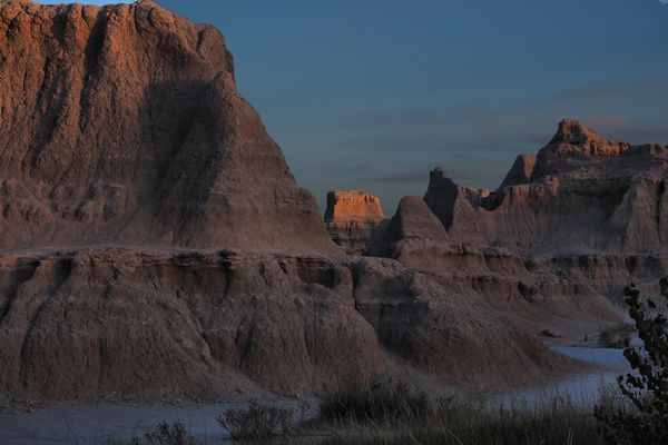
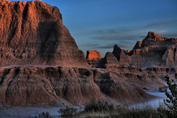
[0] Original in-camera JPEG
| 
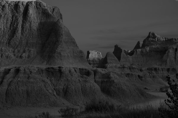
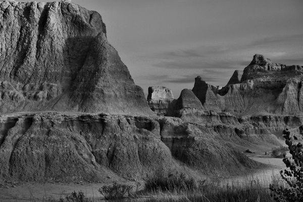
[M0] Monochrome conversion of [0]
Quite disappointing; muddy and lifeless. Remember that my Picture Mode setting reduces the contrast (so that it can be better adjusted in postprocessing). Does not capture the mood of the scene; quite boring.
|
Removing the color information does not help, either. Still, both pictures in this row are just for reference.
|
| 
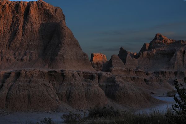
[1] Tonal curve adjustment in [0]
| 
[M1] Monochrome conversion of [1]
This is, more or less, my "normal" degree of postprocessing of in-camera JPEGs. While usually it is sufficient (or more), here it is not. While there is some detail in the foreground rocks, they are still quite lifeless. No cigar.
|
Applying a red filter in monochrome conversion helped to extract some more detail in foreground, but not enough.
|
| 
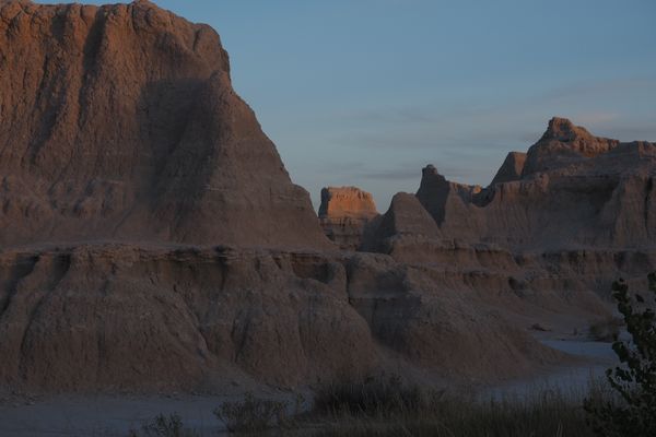
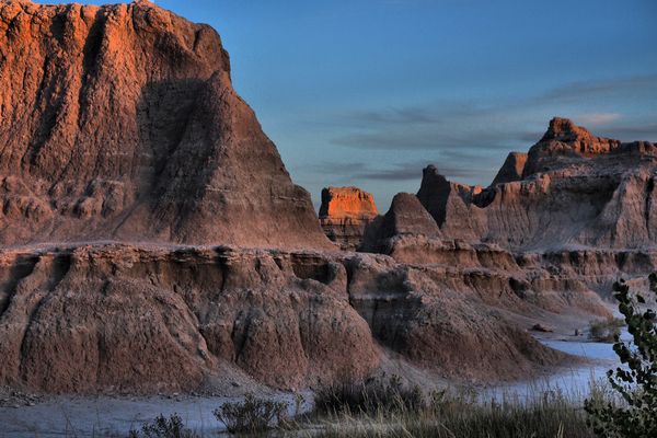
[2] Moderate fill effect and local tone mapping in [0]
| 
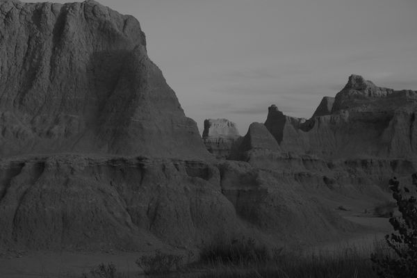
[M2] Monochrome conversion of [2]
While the fill effect helped a bit, it was the local tone mapping which makes the picture presentable. While some others (see below) show more oomph, this one is closest to what I remember.
|
The monochrome version still seems not strong enough for my taste; in spite of more detail. I wouldn't hang it on the wall.
|
| 
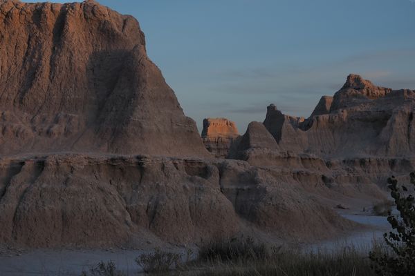
[3] Mid-tones moved down in [2]
| 
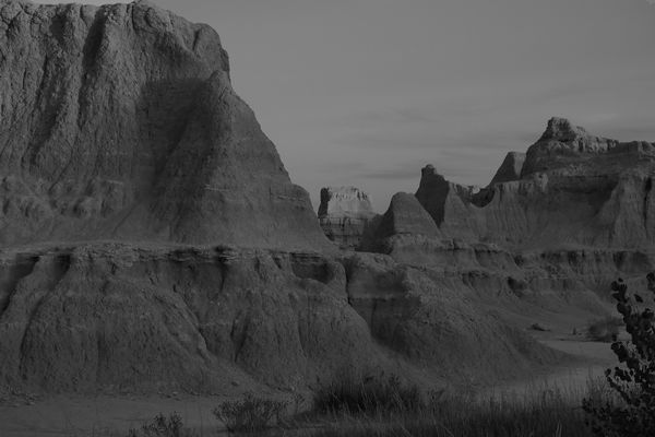
[M3] Monochrome conversion of [3]
This is like sample [2], but with the center of the tonal curve moved down by 12 units or so. his works nice with many landscapes, but I think (most of the time, at least) I prefer the previous version, [3].
|
While the previous monochrome version is more realistic, this one is more dramatic. Tough choice, again.
|
| 
[4] Stronger fill effect and local tone mapping in [0]
| 
[M4] Monochrome conversion of [4]
Here I went a bit overboard with local tone mapping. The technique extracted lots of detail and depth from the foreground. The result is very pretty if not quite true, like in many pseudo-HDR images in the Amazon Fire Stick screen saver. This would be my favorite — if I haven't seen the original scene. OK, call me a cheater.
|
Wow. A monochrome version of [4] looks like a print from late 19th century. While quite strong, it is nor overdone like its color sibling. Not too shabby.
|
| 
[5] Mid-tones moved down in [4]
| 
[M5] Monochrome conversion of [5]
The previous version, with the mid-tones additionally moved down; it became dramatic to the point of cheapness. I prefer the last one, [4]. Still this one might be OK in a calendar or a jigsaw puzzle.
|
Surprise! This B &W version of the gaudy [5] may yet become my favorite.The foreground is detailed, three-dimensional, and starkly dramatic; the rock chimney smack in the center — bright but not overblown, attracting your attention without becoming the sole subject..
|
|
For most of landscape pictures, those taken under "normal" lighting conditions, we do not usually have problems establishing the right image tonality (or what is generally recognized as such). USing local tone mapping would be an overkill in such cases. For some subjects and/or conditions, however, LTM may be a life saver, when used in moderation. Try it.
| ||
| This page is not sponsored or endorsed by Olympus (or anyone else) and presents solely the views of the author. |
| Home: wrotniak.net | Search this site | Change font size |
| Posted 2018/05/11 | Copyright © 2018 by J. Andrzej Wrotniak |