
|
Contrast, sharpness, and saturation in Olympus C-5050Z |
|
| My other pages related to the Olympus C-5050Z, C-5060WZ, and X-7070WZ |
|
Among many features, the Olympus C-5050Z allows you to set separately image sharpness, contrast, and color separation; each in eleven discrete steps marked from -5 to +5 on some arbitrary scale. This is nice, as you may really want to make these adjustment, depending on a number of factors:
Regarding the last aspect; the rule of thumb is that pictures intended for use without any (or almost any) postprocessing may ask for more aggressive settings, chosen by Olympus at defaults. On the other hand, if you intend to tweak your images in a graphics program, milder settings are safer, preserving more of the original information and allowing you for a wider range of adjustments. If you are reading this page, you probably already know that, but — just a reminder... In order to learn the possible range of in-camera image adjustments I took a series of test shots on a typical subject: a banal view off my patio on a sunny afternoon. Once the work was done, I decided to post the results on these pages, hoping that some Readers may find them useful or entertaining. | |
|
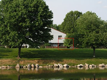
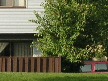
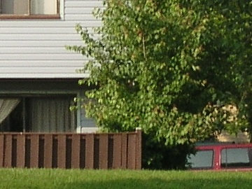
This is the full frame, reduced and re-sharpened, shot at default settings of sharpness (irrelevant after resizing), color, and saturation. The red box shows the position of unaltered 1:1 samples presented below. (The full-size frame, also included, clearly shows how good the C-5050Z really is. Tweaking the settings can only make it ever-so-slightly better). To get all fifteen shots under as similar conditions, I've waited for a ten-minute period when the Sun was far from any clouds; slight variations in illumination could obscure any changes due to the settings. For each factor (sharpness, contrast, saturation) I took a five shots, at the settings of -5, -2, 0, +2, and +5, with the two remaining factors set to 0. This means that all middle shots (i.e., the third one in each sequence) were taken under the same (0,0,0) settings. |
|
Aperture priority with -0.7 EV exposure compensation (to keep the detail in the building wall): F/4 at 1/400s. Zoom at the long end (EFL=105mm), tripod. Sharpness, contrast, and saturation at default (zero) settings.
A full-size original (2.8MB) can be found here. | |
|
The differences between the samples shown here tend to be rather subtle. If your monitor is not adjusted properly, you may not even see them. Additionally, on LCD screens (like those used in notebook computers) the image brightness changes a lot with the viewing angle. In a typical notebook-viewing situation, when the screen is viewed slightly from above, the same sample viewed near the bottom of the screen will look brighter and less saturated than when near the screen top. The best way to compare image samples critically is to copy them to an empty folder, and launch an image viewing program in the full-screen mode, then using the mouse or the keyboard to move between images. This works expecially well for one-on-one comparisons; even subtle changes in, for example, sharpness, become easy to spot. My recommended viewer (out of six I've tried) is ACDSee from ACD Systems. The free IrfanView has fewer bells and whistles, but does an equally good job, and comes entirely free from its author's site (if you tried the program more than two years ago, you'll be nicely surprised how much it improved). | |
|
Sharpness | |
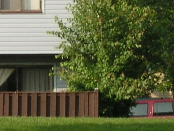
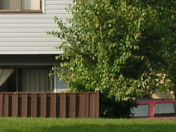
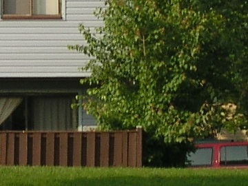
Sharpness at -5 |
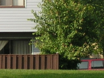
Sharpness at -2 | |
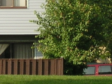
Sharpness at 0 |
Here are 1:1 samples from the image as above, shot at five various sharpness settings, from -5 to +5. Differences, although subtle, are clearly visible, even more so if you download the samples and flip between them using a viewer.
Contrast and saturation were at their default (zero) settings. | |

Sharpness at +2 |
Sharpness at +5 | |
|
Usually I keep sharpness at -2, but after seeing these samples I may move it down, maybe even all the way to -5. Following the general trend, Olympus uses quite aggressive in-camera sharpening, aimed at the mass market. Note some noise in the brown fence, introduced by moving from -5 to 0. While this will not be disturbing in 9x12" prints, the white artefacts of vertical board edges may. (Another sign of overly aggressive sharpening is the white "bounces" along dark tree branches I could see in other samples.) A setting of -2..-5 allows you to apply a smarter sharpening process, if needed, during the postprocessing. Some algorithms enhance contour sharpness while not messing up the rest, at least not much. Contrast | ||
Contrast at -5 |
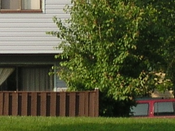
Contrast at -2 | |
Contrast at -0 |
Again, five samples at various contrast settings. Note how clear is the difference between the first and the last one.
The adjustment step is chosen reasonably, even the extreme values are within a reasonable range. Sharpness and saturation were at their default (zero) settings. | |
Contrast at +2 |
Contrast at +5 | |
|
For unprocessed images, the settings from -2 to 0 seem to be fine under these conditions. I keep mine at -1; maybe -2 would be better to preserve detail in shadows and highlights, and to decide later how much to enhance the contrast in postprocessing. This, however, depends on the subject and light. Still, I would avoid positive values even under dull lighting. Note the washed-out curtains (top-left corner) at +5. Note the exposure compensation of -0.7 EV. I usually set it to -0.3, to keep more highlight detail; then I adjust the contrast in the "digital darkroom". The latter seems to be as important in digital photography as the wet darkroom was in film-based one: without using it you could not claim to be a serious amateur. Saturation | ||
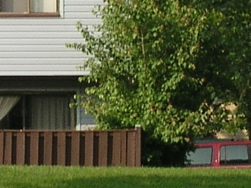
Saturation at -5 |
Saturation at -2 | |
Saturation at 0 |
And once again, five actual-size samples, but this time it is the color saturation which was changing from -5 to +5.
Sharpness and contrast were at their default (zero) settings. | |
Saturation at +2 |
Saturation at +5 | |
|
Many consumer cameras tend to boost the color saturation; this seems to sell best at your local K-Mart store. For me, a separate judgement needs to be made for almost every individual scene. Judging from these samples, the default setting seems to be safest; my preference is +1, leaving any changes to the postprocessing. One '5050 reviewer reported very bad results (color bleeding, loss of detail) when the saturation set to +5. Wake up, smell the coffee: given a tool, you should know how to use it: if your object had already vivid colors, what would you expect? Next thing I'll hear complaints that the exposure compensation of +5 EV blows the highlights out... In this example, the setting of +5, although workable, looks already too saturated (notice the almost-red fence). Conclusions The C-5050Z provides options to adjust sharpness, color and saturations independently, and within a usable (as opposed to exotic) range. As the adjustment is done on the raw image (10 bits per photosite), before conversion into JPEG or TIFF (24 bits), you may lose a bit less in the process compared to doing it afterwards with an image editor. I don't, however, find the difference meaningul. In practice, I keep sharpness set to -2, contrast to -1, and saturation to +1; these seem to be reasonable values on the '5050 (maybe I should move the sharpness a notch down). Your taste may vary; the recommendation is to do some experimentation to find your favorite general-use settings, and then leave them alone, except, maybe, for some really exceptional situations. |
|
| My other pages related to the Olympus C-5050Z, C-5060WZ, and X-7070WZ |
|
Camedia® and Olympus® are registered trademarks of Olympus Corporation.
This page is not sponsored or endorsed by Olympus (or anyone else) and presents solely the views of the author. |
| Home: wrotniak.net | Search this site | Change font size |
| Posted 2003/06/04 | Copyright © 2003 by J. Andrzej Wrotniak |