This caption includes explicit breaks,
to keep it within picture width
An image can be inserted into the text with use of the <img> tag. The tag must specify the image file; its path absolute or relative to the current document. The second option is strongly recommended for a number of reasons, like shown in examples which follow.
The rendered picture size is (for our purposes, at least) best defined by the width attribute as the percentage of the available horizontal space, see <body> above.
Warning and Disclosure:
In all my image-insertion advice below, I'm recommending setting the picture display size by using the width attribute (expressed as percentage) for the <img> tag. HTML5 specification requires it to be in pixels (not actual pixels, mind it, but CSS pixels, another horror story), so what I'm doing here is a direct violation of the standard.
That's where dirty comes from in the title of this article. Yes, this use of width is against the HTML5 standard, but it was allowed in HTML4 and still works on all browsers I've checked. A better solution (which I'm using for wrotniak.net) involves two more HTML features: tables and style sheets, so while it is no longer dirty, it is not so quick, either.
For example, the code
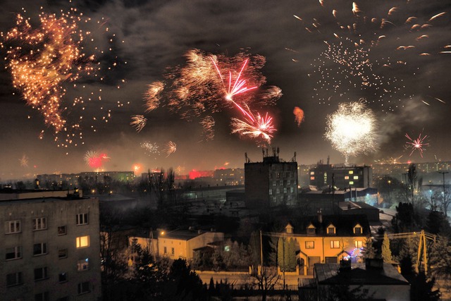
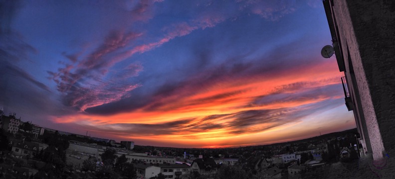
   <p>
   <center>
   <img src=_i/fw-1.t.jpg width=50%>
   <br>
   <small>
   This caption includes explicit breaks, <br>
   to keep it within image width
   </small>
   </center>
renders the following picture with a caption:
This caption includes explicit breaks,
to keep it within picture width
For a single image the width between 30% and 60% will be usually most appropriate. The picture will be rescaled up or down as needed. To keep the loading speed down, I would recommend using image size of 300-600 pixels in the larger dimension (wide, panoramic images are an obvious exception).
More than one image can be inserted as shown above — just use multipl e <img> tags within one paragraph.
The sum of specified widths has to be slightly less than 100% to avoid line breaks inserted by the browser. This is because browsers add a small margin around each picture; its width may be browser- and device-dependent.
In this example, the total requested width of both images is just 90%, small enough:
   <center>
   <p>
   <img src=_i/wl-1.t.jpg width=45%>
   <img src=_i/wl-2.t.jpg width=45%>
   <br>
   <small><small>
   Picture widths: 45%+45% = 90%
   </small></small>
   </center>
The result is as expected, with the whole row being centered:
Picture widths: 45%+45% = 90%
Just in case, you may use the <nobr> formatting tag to prevet implici break insertion (see the next example).
There are two caveats here. First, there is no easy way to provide separate captions, each centered beneath its respective picture. (On my Web site, I am doing this with tables, out of scope of this tutorial.) Second, this approach works best for images of the same aspect ratio (the pixel dimensions may differ). That ratio is preserved in rendering, so as a result we usually get pictures of various heights. This is discussed in the next section.
While setting the rendered picture width as a percentage of available page body width works fine, for a number of reasons the similar height attribute does not, at least not as percentage (of what?).
For example:
   <center><p>
   <nobr>
   <img src=_i/ld-4.t.jpg width=18%>
   <img src=_i/ld-3.t.jpg width=26%>
   <img src=_i/ld-2.t.jpg width=26%>
   <img src=_i/ld-1.t.jpg width=26%>
   <nobr>
   <br>
   <small>
   Picture widths: 18%+26%+26%+26% = 96%
   </small>
   </center>
will render as
Picture widths: 18%+26%+26%+26% = 96%
In this particular case, I tweaked the width attribute values so that the first picture matches (roughly) the others in terms of area, not height. For other image combinations we may prefer (a matter of taste, of course) the other outcome. It is easily done iteratively, by trial and error, usually requiring three to five steps. Here is the result:
   <center><p>
   <img src=_i/ss-4.t.jpg width=39%>
   <img src=_i/ss-2.t.jpg width=57%>
   <br>
   <small><small>
   Picture widths: 39%+57% = 96%
   </small></small>
   </center>
This will show as
Picture widths: 39%+57% = 96%
Various browsers (or even one browser running on different computers) may slightly differ in how they implement margins around images. The resulting differences in picture sizes, however, are small enough to be of no practical importance.
Browsers for smartphones are a different story. They often rearrange the page layout, sometimes in a quite unexpected way. Learn to live with that.
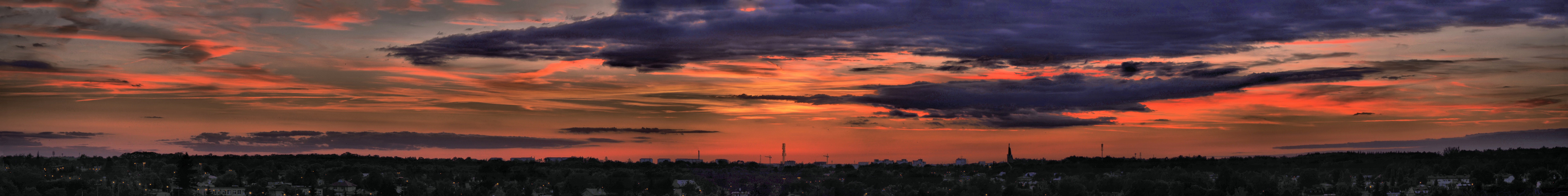
<a>>...</a< scheme. The target my be an HTML file or another image (often a larger version of a thumbnail being clicked upon):
   <center>
   <a href=_i/ss-0.s.jpg>
   <img src=_i/ss-0.t.jpg width=99%>
   </a>
   </center>
This time the image, stored as a JPEG 1200 pixels wide, is shown as a picture rescaled to 99% of the body width (which, in turn, is 75% of the window width). Clicking on it brings up a larger version, 7680×960 pixels, shown in whatever way the browser chooses.
Browsers do not, by default, give any clear indication that an image is clickable. The only visual feedback is the mouse cursor changing to a pointing hand while hovering over it. This can be easily spiced up when you start using style sheets.
Copyright © 2019-2020 by J. Andrzej Wrotniak
2019/07/04, last update 2020/01/31